Mobile App Ad Examples: Plan an Input–Action–Result Demo
Compare two app demonstrations, turn one product task into a shot list, and check whether the result is readable before producing your next mobile app ad.
In this guide
Before you start
A screen recording can show many features and explain none of them. For a useful mobile app ad, begin with one task: something enters the app, a person takes an action, and a result becomes visible. The two references below show how to plan that sequence—and where it can overpromise.
Rock Identifier: decide which part of the result matters
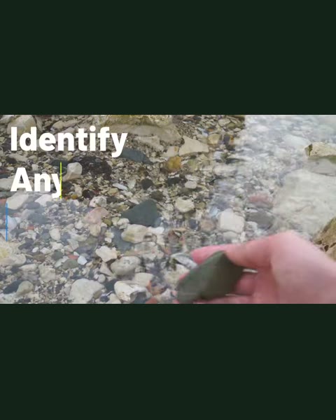
This reference is a 16:9 creative, not a vertical template. Its recorded scene guide starts with a stone and result preview at 00–06s, moves to the camera interaction at 06–12s, presents a Green Jasper result at 12–18s, and adds Quartz properties, formula and hardness at 18–30s before the close. The source record describes a data-rich result, not verified identification accuracy.
Our editorial reading is that the physical object supplies the input while the property information supplies depth. The production risk is trying to show every field at once. A viewer interested in identifying a stone may need to read its name first; a screen full of small values can compete with that answer.
For an adaptation, choose one question the result must answer. If it is ‘What is this?’, give the identity enough space. If it is ‘How do these two items differ?’, plan a comparison. Do not present a speculative value field as a reliable sale price simply because it appears in the interface.
PhilSnap: keep the object connected to its result
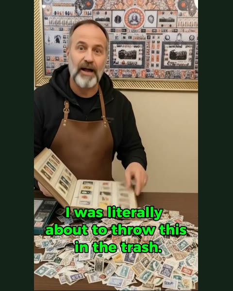
The PhilSnap scene guide describes a stamp close-up, a camera capture and identification, then an identity-and-value result. The critical handoff is from the photographed object to the result screen. That is the part an editor needs to preserve when shortening a demonstration.
A suggested editing approach is to retain a recognizable detail of the object or its thumbnail across the transition. This is a proposed technique, not a claim that the reference uses a particular match cut. It lets the audience follow the same item instead of wondering whether the result belongs to a different photograph.
The monetary question is separate from the mechanics of the demo. You can borrow the input-to-result structure without borrowing a price promise. For a document scanner, the corresponding result could simply be a readable scan of the same page, with no claim about saving hours or replacing a professional workflow.
Build a five-shot brief around a real task
Here is an original hypothetical shot list for a document-scanning app. First, show a receipt with a folded edge. Second, show the receipt positioned in the actual capture interface. Third, record the capture action. Fourth, show the resulting page at a readable size. Fifth, show the genuine next step, such as saving it, if that function exists in the product.
Write the expected output beside every shot before recording. For the fourth shot, ‘cleaner document’ is vague; ‘the merchant name and total can be read’ tells the editor what must survive the crop. Use your own receipt without personal information and a real supported workflow. Do not silently replace a poor scan with a manually repaired result.
Keep a full recording of the interaction even if the finished ad is shorter. If you compress waiting time or omit setup, make sure the edit does not imply a materially different experience. Demo polish should make the operation easier to understand, not conceal what it requires.
- Input shot: identify the exact object or task, with sensitive information removed.
- Action shot: show the gesture that causes the output.
- Result shot: name the one field or visual change viewers must be able to read.
- Continuity check: confirm the result belongs to the same input.
- Next step: show a supported action and verify any access or pricing conditions.
Review the export at the size people will see
Do not judge interface readability only in the editing application's large preview. Open a still from the exported result shot on a phone at the intended viewing size. Without zooming, check whether the important text can be read and whether your overlay obscures the control or result. This is a practical review step, not a universal minimum type-size rule.
The landscape Rock Identifier reference also illustrates why an example's aspect ratio matters. A center crop can remove the very information the ad relies on. For another placement, rebuild the composition around the important input and output rather than assuming a vertical crop will preserve the explanation.
Review with sound off as a separate clarity check. Captions can explain the task, but they cannot rescue a result that is too small to inspect. Then review the sound-on version for consistency: the narration should describe the same action and the same level of certainty as the interface.
Produce one complete demonstration first
A useful first cut answers three questions: what went in, what the person did, and what came out. Add another feature only if the viewer needs it to understand that task. A second complete task usually deserves its own creative brief.
Neither source includes verified install or revenue outcomes for this analysis. Use the references to make your production decisions explicit, then evaluate your own ad against the outcome you intend to improve. A visually convincing demo is not evidence of acquisition performance.
Frequently asked questions
Should every mobile app ad be vertical?
The correct composition depends on the intended placement. One reference here is landscape; use it to study the demonstration, not as a universal export specification. Check the actual placement requirements before delivery.
Can I use a mock interface?
A mockup should not imply functionality or results the product cannot provide. For a demonstration of a real workflow, a recording of the current product makes verification easier. Clearly identify illustrative material when it could otherwise mislead.
How long should the result stay on screen?
Long enough for the relevant information to be read at the intended size. Test that specific export rather than copying a fixed number of seconds from another ad.
Sources and method
This analysis uses HookRef’s reviewed public reference records and their scene annotations. Source listings are linked beside each case; some providers may require an account. We have not independently verified the advertisers’ product claims, ad spend or outcomes. Reference headlines may be editorial summaries, not verbatim transcripts. Suggested adaptations are original teaching examples, not observed ads.
For background, TikTok’s Creative Codes recommends a hook, body and close. The case-specific critiques and worksheets here are HookRef’s editorial interpretations; they are not platform-endorsed performance claims.